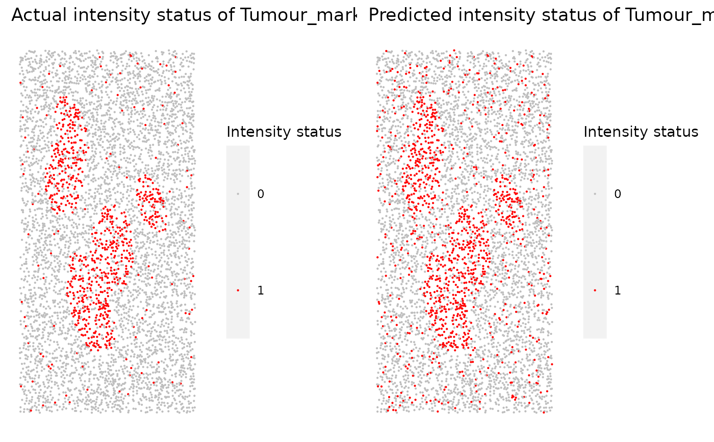
Takes in the returned dataframe from marker_threshold_plot and generates a .pdf file containing scatter plots of actual intensity and predicted intensity for every marker.
Arguments
- predicted_data
Output from
predict_phenotypes.- marker
String. Marker to plot
Examples
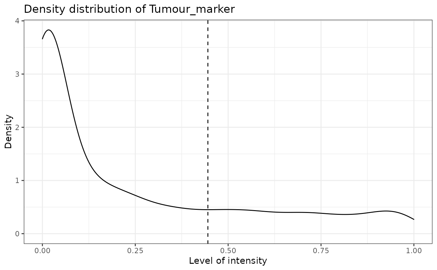
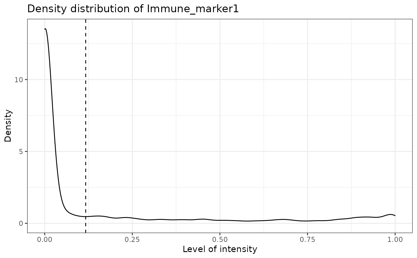
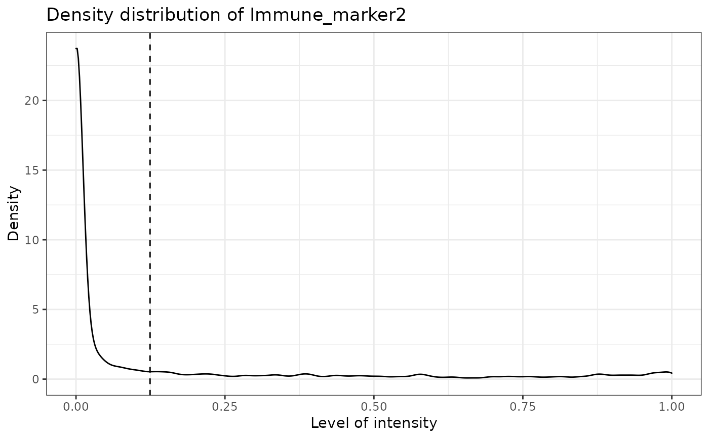
predicted_result <- predict_phenotypes(sce_object = simulated_image, thresholds = NULL,
tumour_marker = "Tumour_marker",baseline_markers = c("Immune_marker1", "Immune_marker2",
"Immune_marker3", "Immune_marker4"), reference_phenotypes = TRUE)
#> [1] "Tumour_marker"
 #> [1] "Immune_marker1"
 #> [1] "Immune_marker2"
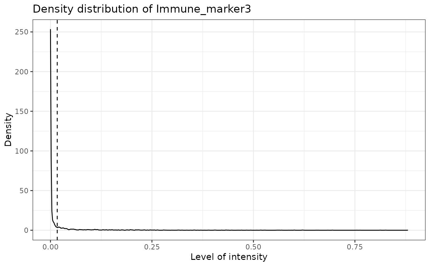
 #> [1] "Immune_marker3"
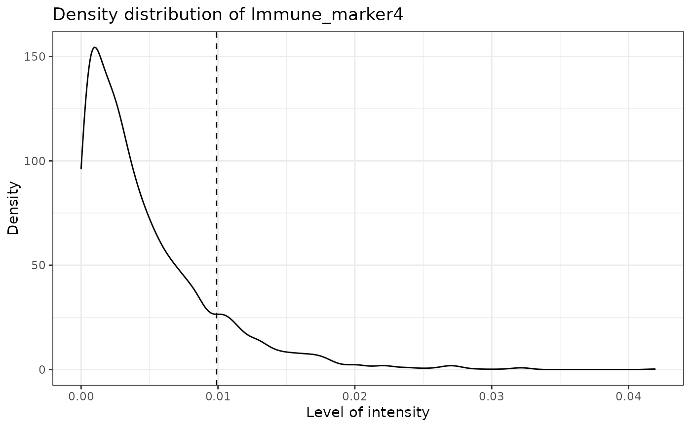
 #> [1] "Immune_marker4"
 marker_prediction_plot(predicted_result, marker = "Tumour_marker")